For my final project in the applied UX/UI course, I was tasked with redesigning a website to enhance its usability heuristics and overall user experience. I chose Duffin’s Donuts, a popular spot for sweet treats in East Vancouver, as its website didn’t quite reflect its charm.
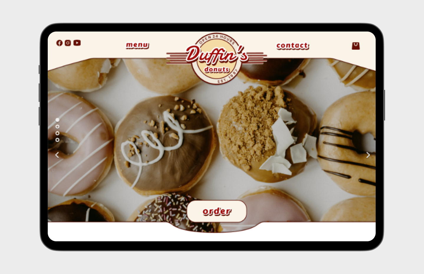
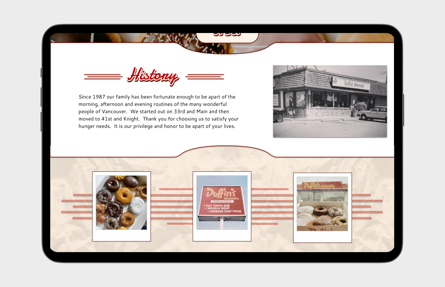
The original site appeared outdated and had some peculiar design choices, such as a lack of visual content and an overall cumbersome feel. To address these issues, I gathered feedback from various users and prioritized enhancing the site's visual appeal. I added an image carousel to the homepage to showcase the doughnuts, included information about the shop’s history, and incorporated customer photos to create a more engaging and visually appealing experience.
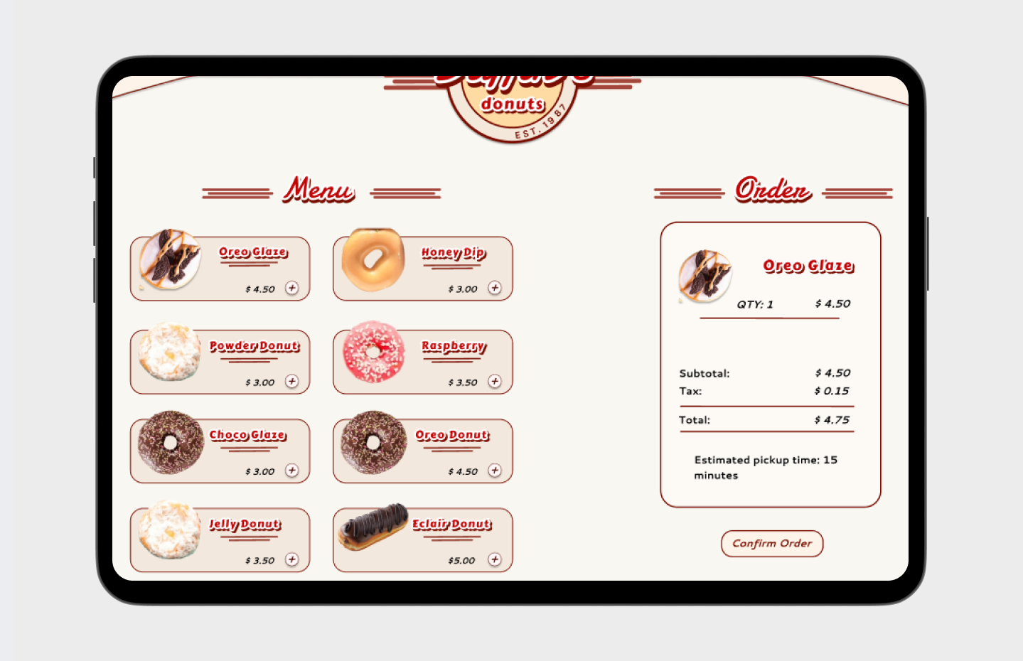
Since the shop doesn't offer delivery and previously only had a call button for orders, I included an estimated pickup time and added visuals for each menu item to improve the ordering experience.
While preserving the iconic red and yellow from the original branding, I chose to use more muted tones to avoid overwhelming users. These softer hues were used to explore various colour combinations for the redesigned wordmark logo, aligning with the updated website redesign.
Original Duffin's Donuts Website.
Software Utilized: